Extensive research and consultation yields latest update to city’s world market projection.
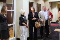
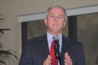
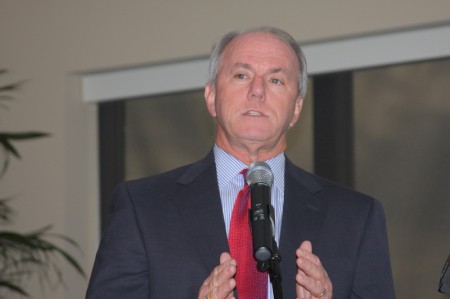 In a well-attended reception on the fifth floor of the new Farmers and Merchants Bank Tower, Clarksville Mayor Johnny Piper jubilantly invited the guests to witness the unveiling of the city’s new brand. Branding is a marketing term that encompasses a municipality’s slogan and logo as a unified identity characteristic. The invited audience was filled with luminaries of all stripes, to include Jim Durrett, the Mayor’s Chief of Staff, State Senator Rosalind Kurita, Mayor Pro Temp Barbara Johnson, APSU President Tim Hall, City Council members Geno Grubbs, Deanna McLaughlin, Jim Doyle and Wayne Harrison, Arthur Bing of the Clarksville Transit Systems, C-MC Schools System Director Michael Harris, CPD Deputy Chief Frankie Gray, as well as Interim Co-City Attorney Tim Harvey.
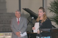
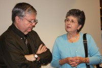
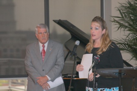 Mayor Piper opened the reception with welcoming remarks and thanks to the members of the City Council’s Communications Committee which had worked so diligently on this project. Council members Deanna McLaughlin and Geno Grubbs gave the story of the development of this new brand. McLaughlin spoke of how the idea of a new brand came to be and development of the concept and focus which it should address. Grubbs added that committee members had worked through an extensive amount of public comment and input and then reviewed that data with the marketing firm of MMA Creative. Mayor Piper he was confident everyone would be impressive with the new brand/logo.
Council members Geno Grubs and Deanna McLaughlin address reception guests.
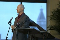
 Mayor Piper introduced MMA Creative President/CEO Mike McCloud (above), who guided the audience through the unveiling. He spoke of how the Council’s Communication Committee’s focus research had resulted in the criteria that was pursued in creating this new brand for Clarksville. That research showed that our strong points, according residents input, centered on a ideal location and accomplishments of our people. From there, it was determined that the final brand/logo had to be Authentic – distinctive and true to our community and our objectives as a community on the move; Creative- visually eye catching, with a message that covers many important thematic bases; Easy to Adapt- readily workable and easily incorporated alongside all city promotional efforts, including economic and community development, tourism and public events; Memorable- its look and message should be easy to member and leave a lasting impression. McCloud said that he and the Committee believe that this new brand meets all of these criteria.
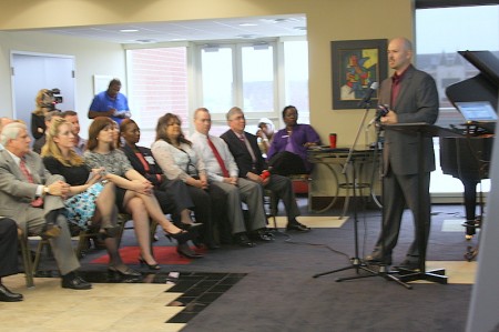 Now the concentration will shift to prioritizing and assessing how best to roll out the new brand/logo in a cost-effective and efficient manner. Incorporating it onto a re-design of the City Website and determining how to use it and its message at the City’s promotional booth at an upcoming major retail business trade show in May are already being discussed, according to a press kit handout. (Above- MMA Creative’s McCloud addresses reception guests.)
Additionally, City signage and promotional materials will have to be updated with the new brand/logo, to include promotional material for public events. McCloud stated that a realistic timeframe for full implementation can be as long as two years. Gathering cost estimates for replacing current signage and all existing promotional materials will begin soon. Meanwhile, the City will begin encouraging businesses and local community groups to start using the new City brand/logo where and when appropriate in promoting their own respective events or activities.
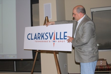 (Mike Kopp, MMA Creative VP of Public Affairs Strategy displays the City’s new Brand.)
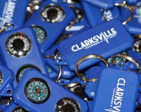
The technical development aspects having been dispensed with, McCloud began the unveiling. From his laptop he opened a projected animation which displayed the city’s name in large blue lettering against a white background. Then in the lower right-hand corner a small compass dial appeared and started to spin. Finally, a red compass needle materializes, rotates and settles True North, representing the “I” in Clarksville, as red lettering materializes below the city’s name, proclaiming, “Tennessee’s Top Spot!”. With that, a large easel billboard was turned around to show the new brand in hard copy. See photo above. “Clarksville – Tennessee’s Top Spot!” was launched. Commemorative key chains emblazoned with the new brand/logo in white lettering on a blue background, were then made available to the guests.

There was no media coverage from Nashville; only local media outlets were present.






In looking at the new Tennessee’s Top Spot logo, my first reaction was “you’ve got to be kidding!” That was quickly followed by the words “generic”, “uninspired”, “bland”, “boring”… Sounds like the name of a local bar.
The old logo had so much more character (if necessary, drop the “new” and just be “Gateway to the South.” The bright green was lively and eye-catching. I look at the new slick streamlined logo and say “so what?” The compass points north (as in “the way out of town”). It almost has a science fiction feel to it. Star Trekkie maybe? Pointing to a galaxy far, far away?
The colors (red white and blue notwithstanding) are dull, the lettering the kind of dime-a-dozen ordinary that matches the dime-a-dozen rubber-stamped designs of new homes, apartment buildings and condos sprouting up all over town and coming soon to a downtown near you. Drive into any large new development in the city and each home looks like every other home in color and style. This logo looks like any other ordinary low-budget business sign.
My second reaction was to ask “top spot for what?”
We have the Customs House Museum, periodic performances at APSU, the wonderful Roxy for community theater (I live in hope for the creation/opening of their arts center), and a few unique shops, eateries and galleries on Franklin Street. But my friends and I go to Nashville for everything from theater to ballet to symphony to movies to a large selection of fine non-chain dining to the Titans).
Memphis has Beale Street, great Jazz and terrific annual sci-fi convention. Chattanooga has its aquarium, among other creative developments. The Pigeon Forge region can keep families busy for days. Paducah (in KY) has its quilt museum and unique “art colony” development. What is it that makes us “Top?”
Clarksville might be the top spot for fast food restaurants, for movie theaters offering the most banal mainstream movies, for horrific traffic congestion, for Wal-Mart superstores, for the greatest number of pawn shops and title loan companies on a single boulevard, for car dealerships, for the most obnoxious bright orange fireworks shop in the country (now that’s blight!), for the largest designated area of so-called “blight” in the country, for unchecked housing development erected without addressing infrastructure issues …
Though I have met wonderful and inspiring people here, when I moved to Clarksville in 2004, I knew little about the city. When I wanted to explore, and introduce the city to a visiting friend, I called the Chamber of Commerce to inquire first and foremost about restaurants that offered our entertainment of choice: “fine dining” (i.e., a place with linen table cloths and candlelight, maybe a small jazz combo offering music etc). The Chamber spokesperson, sitting in an office which was then right next to the former Rose Garden restaurant, said “I don’t think we have anything like that here.” That response came with NO suggestions for anything. As a Clarksville newbie I thought “You’ve got to be kidding.”
When the Metropolitan Opera in New York City decided to offer worldwide screenings (Live in HD) performances, I wrote to our local theaters and asked if they would consider bringing these screenings (eight Saturday afternoons a year) to Clarksville. Not possible, they said, and not in our strategy. At $22 a head (Live in NYC it is $100-$150 a head), my friends and I are part of a CONVOY of Clarksvillians who regularly travel to Nashville where TWO large theaters are all but SOLD OUT for all of these shows. Of course, we take our dining and shopping dollars to Nashville too.
Before a city can call itself a “top spot” it has to be a “top spot.” Clarksville is nowhere near there. Given the length of time true and carefully considered redevelopment takes (10-20 years), it may get there, but I know I will be too old to enjoy it or will have moved on and out. Of course, slap-dash unchecked development comes faster but is far less appealing in the end. Slap-dash or development doesn’t merit the “top spot” designation.
When I think of the South I think of a certain charm and appeal, a certain culture and history that does not have to preclude progressive development but instead work hand in hand with it. The prior logo was much closer to that and had a certain warmth and a welcoming charm. The new logo lacks all of that and has no “connect” with what Clarksville is or aspires to be.
The only benefit to this new logo that I can see is the profit sign-making businesses will generate as they replace all the “Gateway” signs.